
How to Create Videos that Are Mobile-Friendly
It is safe to say that we are now living in the age of mobile devices. Ranging from smartphones to phablets, to tablets – the number of mobile devices are growing at an exponential rate and have long since left PCs behind in the dust.
What does this mean when it comes to creating videos? In some ways very little. Most of the newer mobile devices are all capable of Full HD (1080p) resolution which is what most videos tend to be created in nowadays anyway. While it is true that 4K might eventually begin to become more widely adopted on PCs, it is still a ways away so for now on the resolution front there isn’t much of a difference.
What does this mean when it comes to creating videos? In some ways very little. Most of the newer mobile devices are all capable of Full HD (1080p) resolution which is what most videos tend to be created in nowadays anyway. While it is true that 4K might eventually begin to become more widely adopted on PCs, it is still a ways away so for now on the resolution front there isn’t much of a difference.
Similarly in terms of frame rate most mobile devices are capable of 60 frames per second just as PC monitors.
Considering all of that, you may be tempted to think that there’s no real reason to go out of your way to create videos that are mobile-friendly, but there’s one key area that you may be overlooking: Screen size.
The problem that most people face is that they tend to equate resolution with screen size, which isn’t the case. While you may play a 1080p resolution video on your 23 inch PC display, you’ll be playing that same 1080p resolution video on your 6 inch smartphone display too.
Granted the quality will be the same – but the size of the details means that some things may be a lot less visible on a smaller screen.
That is the one huge (no pun intended) factor that you need to keep in focus when you intend to create videos that are mobile-friendly: Size.
The frame and composition of your video needs to account for this, as does the positioning of your central element and maybe even the percentage of display real estate it takes up. If possible, try to preview your video on the mobile-sized displays while you create it – just so you can see exactly what it looks like while you do.
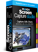
Depending on the software you’re using this may be easy or slightly complicated. With the Movavi Screen Capture Studio it really shouldn’t be too much of a stretch and you’ll have all the features you need to screen capture on PC and then edit and tweak the video to be more mobile-friendly.
In particular, its features that will allow you to set up the recording area and frame rate can enable you to optimize your videos to be mobile-friendly right there during the recording stage. Also being able to crop and rotate it as well as change its resolution will also prove useful.
Of course, to really make a video appealing you’re going to want to polish it as much as possible and maybe even jazz it up with stylish transitions and filters. The Movavi Screen Capture Studio will hand you all that, and will even allow you to enhance the video quality just to make sure that it really does look perfect by the time you publish it.
Info on how to convert MOV to MP4 can also be found at this resource.
 Author: Admin Charlie

